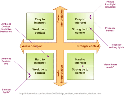
Ambient devices are seductive. They seem like they would have so much potential. I have an Orb from Ambient Devices – currently listening to a stock market index – currently yellow green. I got my dad the Executive Dashboard, also from Ambient Devices, which lets you slide in different displays in a very retro needle display. He can actually monitor three different channels, while I can only deal with one. Philips has been advertising some of their new vision for the future with flat TVs with Ambilight – where the dominant color on the screen is projected to the sides of the TV.
The thing about ambient information is the need for context. My Orb, at best, is relevant to me, because I know what the colors represent and what channel it is listening to. When visitors come over and check it out, they have no idea what it represents. So in this case, the primary owner provides the context.
Now, my dad’s Executive Dashboard has three channels that can be switched up by changing the little card which both tune the channel but also provide the visual meter. For example, he can monitor local traffic congestion by slipping in the display/card. The problem here is that there are three places to insert the card and all cards look similar and all the needles look similar. Suddenly you need to actually read which card are you viewing, what is the scale of the card (temperature, percent, high, low etc) and then where the needle is pointing on that scale – we moved further away from ambient to get a more retro matter of fact feed listener. This device loses all the intuitiveness of the Orb, where as the owner, I provide context to the meaning. In my dad’s case, his device provides the context, but the user needs to actually help build the context by reading what is being displayed – hardly ambient.
Philips Ambilight offers a better application than either of the above. Philips is actually running an algorithm (pretty simple) to pull the dominant color and use LEDs (guessing) to virtually extend that color off the edge of the display and on to the surrounding wall. I have seen this ad in print and on TV and said, “that is dumb.” Then I start looking around and realizing, they might actually have something. First, the context is provided by the TV. Second, the viewer does not need to interpret the ambient information. The context is set by the media playing on the display, the display provides the ambient interpretation and the viewer simply does what they have always done. I bet a month after the owner buys one of these TVs, they no longer notice the ambient effect. I certainly do not look at the Orb all the time to get the current pulse on the stock market, but I know when it has changed.
Ambient information is a challenging space. The fundamental question is, what can be projected to a user that enhances their experience. Clearly, the better the ambient effect ties into the context of the activity the user is experiencing the more useful and apt to be used it is. Additionally, the easier it is to interpret the information the better. Context might actually help here, but if the ambient display takes too long to read (in this case not just text, lets include taste, touch, smell) then it is really more of a dashboard which shows you information around a given context but still requires you to make sense of it. (e.g. a stock trading dashboard will show you the indexes, your portfolio, the trends, the market, the news etc. but it is up to the trader to make sense of it) There is a sweet spot in making ambient information palatable and while we have examples today, none of them have really penetrated the global psyche.


